
Simplifying Bus Rides with Busly
Time-accurate bus tracking to help busy people get around

Overview
-
Summary
A transportation app that helps commuters make better use of their time without waiting for public transport.
-
Problem
Minnesota is expanding bus routes. That also means that more buses will stop at the same bus stop. Commuters used to know which bus is coming and are able to run to the stop when they see a bus approach. However now with more buses, commuters do not know if the bus approaching from a distance is the bus that they are expecting to get on. This can be frustrating, especially if the commuters are running late and have no idea when the next bus will arrive.
-
Solution
A transportation app that helps commuters plan ahead would ease the frustration of commuting in the new unfamiliar bus system. The goal of the transportation app is to provide ease by showing commuters when their specific bus will arrive, time needed to get to the bus stop, and an option to plan ahead to arrive at the bus stop on time.
-
My Role and Audience
Role: A solo case study.
Audience: Commuters in the state of Minnesota.
Discovery & Research
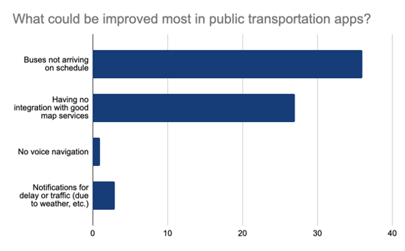

Here are some of the results from the user surveys and interviews. I had sent my survey link to people I know living in Minnesota, and most of them had been college students who rely heavily on public transportation. These findings drove my design process.
User Pain Points
Current transit apps does not alert you when transportation is running late
Waiting for public transportation can be frustrating
College student, age 23
I wish bus times were accurate in the apps that I use so that I don’t have to chase them when I see them.
Competitive Analysis
Strengths
Provides schedule and routes of buses
Allows users to set reminders to leave on time
Allows users to add to calendar
Shows users walking route
Gathering data for accessibility, crowdedness, temperature, and security onboard
Google Maps
Weaknesses
Actual bus arrival time does not match the app’s schedule
In bus mode, google maps will not voice navigate so when users need to walk to get to bus stops, users have to keep checking their phone
Opportunities
Voice navigation should be on for walking even if using bus mode
Screenshot showing transportation scheduled arrival with data gathering for accessibility, crowdedness, etc.

Strengths
Shows approximate number of calories burned if the user chose to walk or ride a bike
Shows walking time in a circumference as a function of the distance
Voice navigation remains on
GO Stats includes calories burned, trees saved, and money saved.
Very easy to navigate
Citymapper
Weaknesses
Not sure if buses are real-time
Opportunities
Takes you to book an uber/lyft from the app

Screenshot of “GO Stats”.
Strengths
Real time bus (shows exactly where the bus is located in the map)
Lays out different travel options on a time table
Shows detour in effect / road closures
Set reminders to leave
Shows number of bikes and empty docks
Includes average price on uber and lyft
Linked to uber and lyft account that allows you to request ride from the app
Transit
Weaknesses
No navigation
Very touchy map which will change transportation option if map is dragged
On first impression, the number on the bus could be interpreted as time it needs to arrive rather than the time it was last updated by the bus company
Opportunities
Include navigation to the stop

Screenshot of map view with real time bus location and detour notification.
User Need States
Using the research I have conducted, I have determined user need states for this case study.
Commuter
Aspirations
“Spending less time waiting for transportation gives me time back for work and school”
Goals & Needs
Real-time bus tracking in transportation apps
Ability to schedule trips ahead of time
Wants to be alerted when bus is delayed
Spend more time working on school assignments
Information Architecture
To organize content, I have created user stories for the persona to guide the creation of a user flow.
User Stories
| Human Need State | Task | Steps |
|---|---|---|
| Commuter | wants to go to a destination | needs to type in destination |
| needs to select destination based on suggestions | ||
| needs to select his most preferred route | ||
| needs to follow travel directions suggested by the app | ||
| wants to create an account in the app | needs to type in username | |
| needs to create a password | ||
| needs to re-enter password to confirm | ||
| wants to check how long he needs to get to a destination | needs to type in destination | |
| needs to select destination based on suggestions | ||
| needs to prioritize shortest travel time | ||
| wants to see where the bus he is expecting currently located | needs to elect his most preferred bus route | |
| wants to plan trips ahead of time | needs to type in destination | |
| needs to select destination based on suggestions | ||
| needs to select his most preferred route | ||
| needs to select option to schedule trips | ||
| needs to enter a date and time expected to leave or arrive | ||
| needs to enable notification/reminder to leave on time |
User Flow
I then developed a wireflow-like sketch using inVision app.


Wireframe Sketches
The sketches were used to determine different UI elements and positioning. Due to time constraint the sketches were quickly turned into prototypes.


Brand Development
My goal was to provide users with a calm experience while tracking and planning public transportation. With that in mind, the logo was designed based on the silhouette of a bus. I decided to add pupils to the eyes, looking upwards to bring a feeling of positivity. The colors were chosen to reflect the feeling of calm using blue, positivity using orange, and efficiency using green. The colors chosen were also accessibility tested using Adobe Color and are color blind safe.


High Fidelity Prototype
Key Findings
After building a high-fidelity prototype, the app was shared with 3 different users for usability testing. Here are some of the scenarios:
Go to Minneapolis Institute of Art
Look up buses arriving at washington and state
Change your starting location to university village east
Set reminder to leave on time
View your favorite locations
The main takeaways from the usability testing to add on for Busly 2.0 are:
Buy credits for buses regardless of the city you are currently in
Alert when bus is late due to weather/traffic
Safety alerts
I would also like to explore efficient transportation systems in busy cities such as New York, Singapore, and Seoul, to understand how efficient transportation system is done all over the world. Another area of opportunity would be to help people with diverse abilities get around easily.
Final Thoughts
This was my first project from the bootcamp and I was able to learn and practice the UX design process. The public transportation in Minneapolis is familiar to me as I relied on it heavily in my college days. I enjoyed being able to make informed decisions from the data collected in a survey, and to come up with a solution.
Moving forward, I would like to incorporate designing for edge cases early in my process. This way it would benefit a larger range of people.